As a kid, I used to stalk pro developers online and be amazed with their cool personal sites. I wanted to make one as well, so I used Blogger to easily customize my blog: Beauty Beauty (P.S.: It’s not a beauty blog.) Beauty Beauty always lives in my heart, but I figured it’s time to move on.
Now, as a third-year Computer Science student, I want to start from a blank canvas so I can have total control over it. It seems fun to experiment and customize the content, layout, and design. I also sort of need a “main station” for all my social media accounts to organize my online presences.
The Vision (i.e. researching and conceptualizing)
The desire brought me to the research of the best personal portfolios. They were all too good to be true, but instead of killing my spirit, it somehow fueled the fire. So for the following week, I brainstormed ideas on how to make my own website. I want it to represent my personality, interests, and aspiration, and I took it very seriously.
Turned out, it was hard to create something truly authentic. I want each detail and decision to have a meaning. I know from the start that I want the main color to be purple (I love purple), but then which shade of purple? And that’s only for colors. What about the menus? What and where should they be? Should I add a blog section or not? Yadda, yadda.
I had to discover my deepest passion and future aspiration to answer all the questions. So I went to Figma as my ultimate go-to for UI/UX design. The rough desktop prototype flowered within 2 days, and I felt quite satisfied with it. I thought of making a mobile version as well, but I figured it would take too long, so I only drafted it in my head.
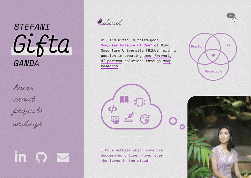
The website represents all the things I love: purple color, butterfly, simplicity, coding (projects), writing, and monospace font. The About section was the hardest to conceptualize because there are so many possibilities on what to put there, but in the end I decided with one sentence highlighting my passion and some illustrations as TLDR.
I’ve always loved a fixed left sidebar because it is within eye reach — simply glance to the left instead of scrolling or looking up to navigate between pages. It is also easier because the menus are in the middle of the page. Then I added my full name above the menus, highlighting my nickname. And naturally, below them are my social media links with icons.
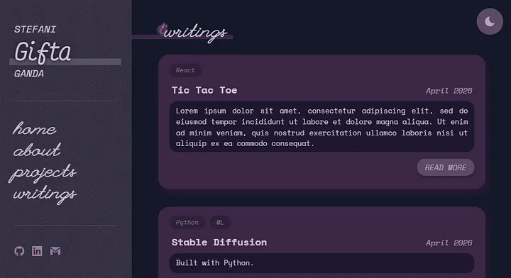
The Projects section is, as the name suggests, for the list of my past works. I also decided to add a blog because I’ve always loved writing and sharing, which is also a way to organize my thoughts. Although I can write in Medium or Substack, I just thought a personal web could be a “one for all” container for all my writings.
P.S.: In the prototype, I forgot to add education and other related experiences like volunteering. I added them during the coding process.
With that, I know the design and content, so now it was time to start coding. I want responsivity, performance optimization, light/dark theme, and Indonesian-English language toggle. I also want to have archives of design or version tagging, something I dreamed to have for my old Blogger-powered blog. For the tech stack, I chose vanilla HTML, CSS, JS.
And since everything was figured out, I started cooking.
The Implementation (i.e. coding with vanilla)
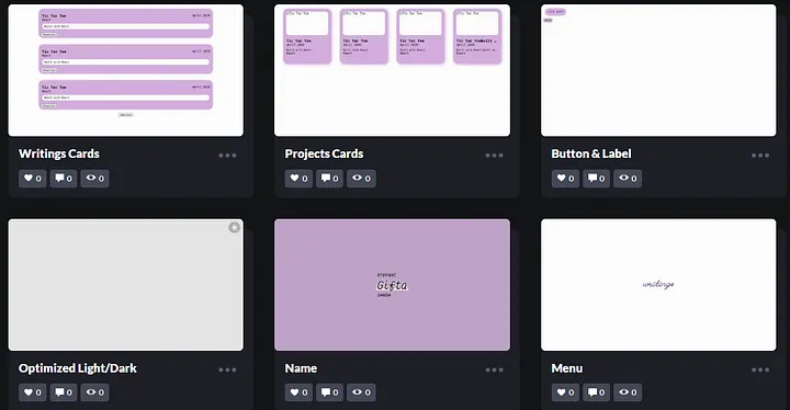
I always start with experiments on CodePen. One by one, I built the components with vanilla HTML, CSS, and JavaScript. Once I was satisfied with the results, I combined the components — which were coded in my private CodePen to minimize the public ones for cleanliness — into cards, and then proceeded to arrange the left sidebar and overall sections.
Main Structure (HTML Tags for SEO Optimization)
I wanted the page to be optimized for SEO, so I tried to use the right HTML tags. I’ve learned some such as <nav>, <section>, and <footer> from my blogging years, but I admit my knowledge about it is quite limited. I always think I use too much <div> and <span>. So I searched for other tags, and turned out the list is long!
Wasn’t sure how to use each one, I utilized my fellow Claude AI again. From just one prompt, I discovered that the tags I was looking for were <aside> from the left sidebar and <main> for the sections. Within the sidebar would be my name, navigation menu, and social media links. The sections are Home, About, Projects, and Writings.
Purple Design (CSS Variables, Keyframes, etc)
With the main structure thought through, I started coding the design. Since I already established the light-theme colors in my Figma prototype, I only had to copy them to my variables in the :root part. I also tried testing some color combinations with WebAIM’s Contrast Checker, just to be sure, in case my eyes had betrayed me.
For the dark-theme (in CSS: [data-theme=”dark”]), I used the base purple colors and experimented with the darker shades. I wanted it to be neither too gray or too purple so balancing them took some time, but it was worth it in the end. I also decided to add some smooth fade-in animation using CSS keyframes. The night after I finished the design, I slept safe and sound.
P.S.: Using purple in CSS without the rebeccapurple (#663399) feels quite disrespectful. Sadly, the shade was too dark for my light theme yet too light for my dark theme :( But I do plan to use it somewhere. (Try to guess where it is if you ever visit my website!)
I also customized the selection color with the CSS ::selection pseudo-element and where users can highlight texts with the user-select property. In the (near) future, I will probably add some more customizations, like for the cursor, scrollbar, and tooltip.
A Little Backend (Vanilla JavaScript)
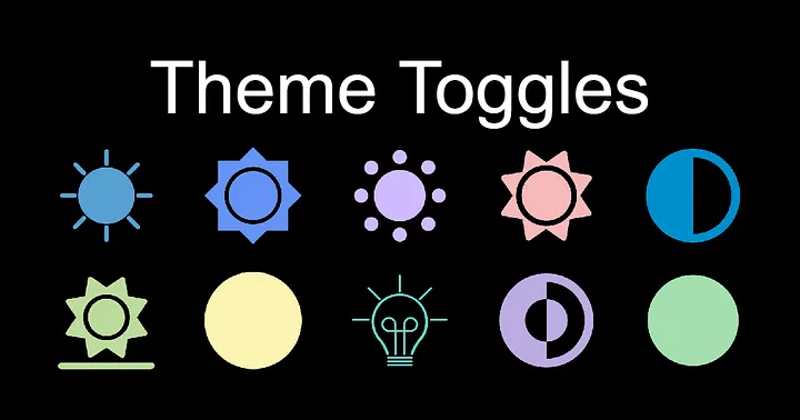
To toggle between light and dark themes, I used the library from toggles.dev. I used the “Expand” one, and I reeeally love the smooth transition from sun to moon. The placing and resizing were also easy, and the JavaScript code was not too complex with the classList.add(“theme-toggle--toggled”).
I played with the toggle for probably a solid 1 minute, just because. It’s just sooo smooth and satisfying! In the CSS body {}, I also added transition: background 0.3s, color 0.3s; for a smoother background and text color transitions, which just added to the satisfaction of playing around with it. Also, I thought of adding a toggle for language translation in the future.
Challenge Encountered
The hardest part was making the About section. I tried to make the design as close as possible to my Figma prototype, and turned out it was so hard that it took me a whole day just for this section. The SVGs, colors, and responsivity were tricky.
Especially the SVGs. I created SVGs for the Venn diagram and cloud shape with the help of SvgPathEditor and SVG Viewer as well as Claude for the accessibility in the HTML (with <title>, <desc> elements). Finding the icons for each hobby and arranging them inside the cloud were harder than I imagined. Making them responsive was also a challenge, but after some hours I kinda figured them out.
In the end, I decided not to design the tooltip I created in my Figma because it would’ve taken a longer time. After the SVGs were done, I moved on to thinking about a SEO-friendly description for the hobby paragraph, persuading people to explore my hobbies online on the platforms Goodreads, CodePen, Medium, and Letterboxd.
For the final touch, I adjusted the SVGs and texts colors for both light and dark themes. However, I wasn’t satisfied yet, so I added a pulsing heart animation with CSS keyframes. (God, I love CSS keyframes.) Last but definitely not least, I added education and work experiences. And with that, my sections were completed!
The Migration (i.e. converting vanilla to React)
My design was completed, but I forgot about the content. With vanilla, I would have to hardcode the whole data or use JavaScript — neither option is clean. Then, I remembered my React experience before for one of my past projects. A component-based framework would be great!
Luckily, I’ve made a React repo template before, so I could simply use it in my portfolio repo. However, I was wondering if React was crawlable and good for SEO. Well, it isn’t. However, I learned that combining it with Next.js would make it more SEO-friendly.
This is my first time getting my hands on Next.js for my project. It’s also the first time that I have to migrate from CRA to Next.js, so I used the official documentation for this. However, it uses TypeScript which I’ve never learned. I didn’t think I have time to learn a new language, so I just used JavaScript. For the debugging, I utilized Copilot.
P.S.: I’m using GitHub Codespaces for the IDE.
It was fun at first, but slowly got complicated when I wanted more features like filtering and sorting. Some bugs and errors started appearing, and some I’ve seen before, but some I haven’t — for those, Copilot was my savior. Gotta admit, I vibe coded a bit to accelerate the process.
I also relied on browser developer tool (right click -> “Inspect”) a lot to debug and experiment with designs. And I thought of creating my own 404 page for link errors. The current design doesn’t match my website. Maybe I’ll do that someday if I have free time. I remember I designed one for my Beauty Beauty blog, but I’m not sure if I still have the file.
Midway, I learned to optimize SEO with metadata, JSON-LD, and XML sitemap. This is like the HTML tags with a long list of properties. I tried adding the JSON, and then asked Copilot to make it better, and it ended up giving me dynamic metadata and sitemap generation! Now the site can control what’s shown on search engines.
The Publication (i.e. deployment using Vercel)
I think I’m pretty satisfied with the overall design, layout, and content now, along with the interactive elements, animation, and hidden metadata. What’s left is moving from local server to the cloud. For this, I choose Vercel which maintains the Next.js. It is also easy to deploy it since I’ve used it before.
Within minutes, the website is live on stefani-gifta.vercel.app! I tried to open it in my phone, and I realized I forgot to add responsivity for the left sidebar. I then tried to hide the sidebar in mobile view before sharing the link, thinking whether I should make a burger icon or adding the sidebar as a section at the top. In the end, I added both. And for now, I’m done!